— AI-driven matching that connects businesses candidates
MY ROLE
I led the B2B design of Kaie minimum viable product (MVP). Insights from Kaie’s leadership were used to create informed designs of the business dashboard and onboarding. Design work includes competitive analysis, usability testing, and low/high fidelity wire framing.
TEAM
2 Designers
4 Developers
PROBLEM
Traditional hiring processes overwhelm teams and make it difficult to identify the right talent.
OUTCOME
On March 2025, Kaie shipped a responsive web application with 3,000+ new users on launch day.
SKILLS
Visual Design
Rapid Prototyping
Onboarding Design
CHALLENGE
Creating a fast, low-effort way for hiring teams to share what they need so Kaie can make smarter matches.
My goal was to design an onboarding flow that collects the right information from hiring teams in under 5 minutes, so Kaie can generate more accurate candidate matches and reduce time spent reviewing irrelevant applications.
Research
COMPETITIVE ANALYSIS
To inform the onboarding design, I conducted a competitive analysis of platforms with profiles and opportunity posting features, focusing on UI patterns, pain points, and gaps for differentiation.
Progress bar is small and less distracting.
Input hints guide user when filling out information
Visual card being created as user inputs information
Progress bar grabs a lot of attention on the page
Side by side input fields reduce scrolling
Input field between two CTA looks crowded
Input hints guide user when filling out information
Ability to use previous inputed information
Questions include personalization
No definitions of terminology used
Design Iterations
ITERATION ONE
Using the examples I had gathered, I created an initial concept to test with business users and see how well it matched their expectations. I tested with 8 users. During facilitation, I asked questions including: “what stood out?”, “what felt missing?”, and “what was worth keeping?”.
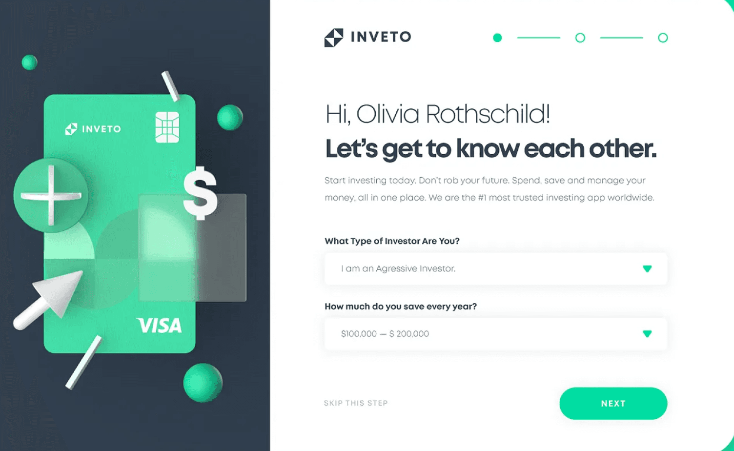
Welcome to Kaie
Lorem ipsum dolor sit amet, consectetur adipiscing elit. Nunc hendrerit libero id nisi sollicitudin, eget bibendum nulla porttitor. Curabitur aliquet et lorem sit amet congue. Sed et placerat orci, maximus auctor dolor. Duis laoreet tristique porttitor. Cras iaculis justo enim, a fermentum.
Let’s set up your profile
"The layout feels clean and uncluttered. I like the simplicity."
"The way every section is placed draws my attention to the button”
"The button could be more prominent, it blends in a bit with the background."
Lets start with a few details
Business Name
Website (Optional)
Next
“It's nice that the website field is optional, makes setup feel quicker.”
“The button could be more intentional, maybe 'Continue?”
“I’d like some hint text in the form fields like ‘enter your company name’.”
ITERATION TWO
Incorporating feedback from the first round of user research, I created a second iteration and tested it again with the same 8 users to identify new pain points or opportunities for improvement.
Basic Details
Contact Information
Business Details
Experience Information
Welcome
Preferences
Let’s start with a few details
Business Name
Website (Optional)
Primary Contact
Phone Number
Next
"The flow feels like it’s guiding me through a proper setup, especially with more fields and clarity."
"Feels like a lot to fill out at once. Do you need this all right now?"
"The progress bar is distracting"
Basic Details
Contact Information
Business Details
Experience Information
Welcome
Preferences
Tell me more about your business
Country
Canada
Province
Ontario
City
Toronto
Industry
Telemedicine
Type of business
Early-Stage
Growth
Idea
Non-profit
Enterprise
Growth
In 150 words or less describe your business
Type here
Next
"Can the system remember my answer in case I go back and forth?"
"I like that you included character limits for the long answer section.”
"Not sure what ‘type of business’ means? Whats the difference between enterprise and growth?”
Final Designs Onboarding Flows
The final design includes two core flows: profile creation and opportunity creation. Together, they help hiring teams clarify their needs without feeling overwhelmed. This addresses the core issue of unclear expectations and mismatched candidates.
To keep the process manageable, only three questions are shown at a time. Hints, tooltips, and pre-filled answers are provided to reduce cognitive load and provide additional context. Each step is designed to be concise and focused, with light progress tracking to keep user momentum without distraction.
PROFILE CREATION
Key information is gathered to inform Kaie’s matching algorithm, and curate candidate recommendations. Users can set up their company profile, create job listings, or view their dashboard.
OPPORTUNITY CREATION
Once ready, users can create a job listing for the role they’re hiring for. Based on their input, they’re guided through a questionnaire that collects key business details and matching preferences. As users input details about the role, Kaie automatically processes the data and sorts candidates based on provided success criteria.
Profile Page - Aka Kaie’s Brain
CHALLENGE
Businesses need a simple way to review and update information from job listings generated by Kaie.
The profile page acts as Kaie’s “brain.” The information entered or updated on the business profile will also be used to update all relevant job listings.
Research
COMPETITIVE ANALYSIS
To get inspiration for how to structure the profile page, I looked at how similar products design and organize their profile experiences. This helped identify common patterns, gaps, and opportunities to make Kaie’s profile page more user-friendly and flexible.
Two column layout create clear visual hierarchy making it easier to scan
Primary info on left side with user’s main action, connect, message, etc
Search button looks disabled
Content before fold is crowded with the use of prompt, buttons, search, and cards
Edit button in each section. Can edit content in context rather than moving to a separate page
Minimal use of colour causes the page to looks less engaging
Consistent card structure with strong use of imagery for personalization
Use of tags for skills makes content easier to scan and adds dimension
Navigation bar is overcrowded
Design Iterations
ITERATION ONE
My initial iteration consisted of tabbed sections to break up the information that was collected. An edit function was added to let users edit without leaving the page. I conducted usability testing with 5 business users, focusing on what caught their eye, how easy it was for them to edit information, and how inclined they were to keep adding more information.
Profile
Post
Dashboard
Explore
Profile
Settings
Kaie Xiegar
Account
Preferences
Notifications
Privacy
Support
Edit
Name
Kaie Xieger
Next Big Career Goal:
Here is the pre-filled response the explorer has provided during onboarding....
Skills & Tools
Tag Text
Tag Text
Tag Text
Tag Text
Languages
Language
Language
Location
Toronto, ON, Canada
Career Status
Recent Graduate
"I was expecting more visuals or something to guide me through it."
"It’s clean, but everything kind of blends together."
"I wasn’t expecting tabs, but it feels straightforward."
“It's not clear if I can add or remove the tags directly here."
Design Iterations
ITERATION TWO
My second iteration focused on incorporating better hierarchy. I added secondary functions, such as allowing users to repost their job postings. I tested this design with the same 5 business users asking them the same questions around edibility and engagement.
Knowledge Filled
All
Business Identity
Vision & Impact
Team Identity
Goals & Needs
Matching Preferences
Company Name
Input
Industry
Select Business Type
Location
Input
Input
Business Type
Select Business Type
Business Name
Industry
Location
My Opportunities
View All
Product Manager
Internship
DevOps Engineer
Experienceship
UX Researcher
Part time
"Are these all active?"
"What does this icon mean?"
"The labels mostly make sense, but I’m not totally sure what goes under ‘Vision & Impact’."
“What is Team Identity?”
Final Profile Page Design
The final design consists of two-columns. The primary information gathered by Kaie is presented on the left side. Tabs were removed in favour of a more compact layout that incorporated all profile content on one page.
Vision & Impact
Team Values
Innovation
Empathy
Collaboration
Future Goals
Lorem ipsum dolor sit amet, consectetur adipiscing elit. Vivamus euismod interdum justo, id convallis eros dictum a. Nulla facilisi. Sed nec purus ut enim tincidunt aliquet. Quisque malesuada sapien non urna placerat, ac varius ligula viverra. Donec id felis magna. Curabitur volutpat lacus ac velit maximus, non ultricies eros pretium. Aenean at gravida metus.
Causes or Social Missions
Health Equity
Digital Inclusion
Mental Health Awareness
Accessibility
Sustainable Development Goals
SDG 3 – Good Health and Well-Being
SDG 9 – Industry, Innovation and Infrastructure
Vision & Impact
What values define your team or (company name)’s culture?
Search Item
Innovation
Empathy
Collaboration
Where are you headed?
Copy goes here....
0/160
Which causes or social missions does (company name) care about?
Search Item
Health Equity
Digital Inclusion
Mental Health Awareness
Accessibility
Which causes or social missions does (company name) care about?
Search Item
SDG 3 – Good Health and Well-Being
SDG 9 – Industry, Innovation and Infrastructure
Save
Post Opportunity
My Opportunities
View All
Product Manager
Internship
Active
DevOps Engineer
Experienceship
Matched
UX Researcher
Part-time
Inactive
Business Identity
xxxxxxxxx@email.com
WEBSITE
xxxxxxxxx.com
BUSINESS TYPE
Start-up
INDUSTRY TYPE
Healthcare
COMMUNICATION
Async
Fast-paced
Structured
Team
Team Size
10 Employees
Team Members
J
Jane Doe
Admin
J
John Doe
Member
J
Johnny Doe
Member
Edit Profile

Business Name
Industry
Toronto, ON
Healthcare
Elevator Pitch
At VitalSync, we're revolutionizing healthcare by bridging the gap between real-time patient data and proactive medical intervention. Our AI-powered platform integrates seamlessly with existing EHR systems to deliver continuous monitoring, predictive analytics, and instant alerts for at-risk patients—whether they’re in the hospital or at home. By analyzing patterns across vitals, behavior, and environmental factors, VitalSync empowers providers to anticipate health crises before they happen, reducing readmissions and improving patient outcomes.
Vision & Impact
Team Values
Innovation
Empathy
Collaboration
Future Goals
Lorem ipsum dolor sit amet, consectetur adipiscing elit. Vivamus euismod interdum justo, id convallis eros dictum a. Nulla facilisi. Sed nec purus ut enim tincidunt aliquet. Quisque malesuada sapien non urna placerat, ac varius ligula viverra. Donec id felis magna. Curabitur volutpat lacus ac velit maximus, non ultricies eros pretium. Aenean at gravida metus.
Causes or Social Missions
Health Equity
Digital Inclusion
Mental Health Awareness
Accessibility
Sustainable Development Goals
SDG 3 – Good Health and Well-Being
SDG 9 – Industry, Innovation and Infrastructure
Each section is individually editable, making it easier to quickly update without having to edit the whole page. Tags were incorporated to make the sections more scannable. Delete Icon’s were added to show how tags can be deleted.
Search functionality was added to inputs section to lighten tediously inputting information for the user.
I added the right side panel to surface key secondary info, like the status of recent job listings, without crowding the main view. Core details like contact info live under Business Identity for easy edits. The Team section gives users a quick look at who’s on their team and what roles they have.
My Opportunities
View All
Product Manager
Internship
Active
DevOps Engineer
Experienceship
Matched
UX Researcher
Part-time
Inactive
Business Identity
xxxxxxxxx@email.com
WEBSITE
xxxxxxxxx.com
BUSINESS TYPE
Start-up
INDUSTRY TYPE
Healthcare
COMMUNICATION
Async
Fast-paced
Structured
Team
Team Size
10 Employees
Team Members
J
Jane Doe
Admin
J
John Doe
Member
J
Johnny Doe
Member