Onboarding Experience
My goal was to design an onboarding flow that collects the right information from hiring teams in under 5 minutes, so Kaie can generate more accurate candidate matches and reduce time spent reviewing irrelevant applications.
Onboarding Experience
My goal was to design an onboarding flow that collects the right information from hiring teams in under 5 minutes, so Kaie can generate more accurate candidate matches and reduce time spent reviewing irrelevant applications.
CHALLENGE
Creating a fast, low-effort way for hiring teams to share what they need so Kaie can make smarter matches.
DESIGN REQUIREMENTS
Feel simple and conversational; teams could clarify their needs without feeling like they were filling out a form.
Ensure businesses provide enough initial context for Kaie to make useful recommendations right away.
Reduce friction in getting started while increasing data completeness
Research
COMPETITIVE RESEARCH
The first step in my design process was researching competitors’ onboarding flows, seeing how they used UI patterns, visual hierarchy, and identified gaps where Kaie could stand out.


(Screenshot of competitor onboarding)
KEY LEARNINGS
Progress bars helped set expectations and gave users a sense of where they were in the process without feeling overwhelmed.
Flows were broken into smaller sections or pages instead of long scrolls, which made everything feel more manageable.
UI details, like input hints and reusing past answers, reduced friction and made things easier to complete.
Concept Testing
ITERATION ONE
Using the examples I had gathered, I created an initial concept to test with business users and see how well it matched their expectations. I tested with 8 users, asking questions like: “what stood out?”, “what felt missing?”, and “what was worth keeping?”.

(Screenshot of concept one)
ITERATION TWO
Incorporating feedback from the first round of user research, I created a second iteration and tested it again with the same 8 users to identify new pain points or opportunities for improvement.

(Screenshot of concept two)
Meeting Design Requirements
Each part of the final design was shaped by the requirements set by stakeholders to reflect the brand’s intended feel. Here’s how I addressed them.
Feel simple and conversational; teams could clarify their needs without feeling like they were filling out a form.
Too many questions felt overwhelming, so I broke the flow into short steps with just 2 to 3 questions.
I used friendly language and added personal touches like the user's name to make it feel conversational.
The minimal UI, with Kaie as the only element, made it feel like you were chatting with someone.

Ensure businesses provide enough initial context for Kaie to make useful recommendations right away.

I used targeted questions around stage, industry, and goals to capture the right questions early on.
Utilizing dropdowns, tooltips, hints, and pre-filled answers to guide users to make specific responses.
Reduce friction in getting started while increasing data completeness
Reused previously entered information where possible to cut down labour for the user.
Each step was kept to a couple of questions to preserve momentum.
Progress indicator is used to reassure users and encourage them to finish the full flow.

KEY RESULTS
With the new onboarding design, we saw a 22 percent increase in users completing the flow compared to the old Google Form version.
In a follow-up survey, business users rated their experience as an 8 out of 10 on average. Along with the reduced drop-off rates, this shows that users were engaging with Kaie during onboarding, resulting in less friction and higher completion rates.
— AI-driven matching that connects businesses and candidates
— AI-driven matching that connects businesses and candidates
Onboarding Experience
My goal was to design an onboarding flow that collects the right information from hiring teams in under 5 minutes, so Kaie can generate more accurate candidate matches and reduce time spent reviewing irrelevant applications.
Onboarding Experience
My goal was to design an onboarding flow that collects the right information from hiring teams in under 5 minutes, so Kaie can generate more accurate candidate matches and reduce time spent reviewing irrelevant applications.
Onboarding Experience
My goal was to design an onboarding flow that collects the right information from hiring teams in under 5 minutes, so Kaie can generate more accurate candidate matches and reduce time spent reviewing irrelevant applications.
CHALLENGE
Creating a fast, low-effort way for hiring teams to share what they need so Kaie can make smarter matches.
CHALLENGE
Creating a fast, low-effort way for hiring teams to share what they need so Kaie can make smarter matches.
DESIGN REQUIREMENTS
Feel simple and conversational; teams could clarify their needs without feeling like they were filling out a form.
Ensure businesses provide enough initial context for Kaie to make useful recommendations right away.
Reduce friction in getting started while increasing data completeness
Research
COMPETITIVE RESEARCH
The first step in my design process was researching competitors’ onboarding flows, seeing how they used UI patterns, visual hierarchy, and identified gaps where Kaie could stand out.
Research
COMPETITIVE RESEARCH
The first step in my design process was researching competitors’ onboarding flows, seeing how they used UI patterns, visual hierarchy, and identified gaps where Kaie could stand out.
Research
COMPETITIVE RESEARCH
The first step in my design process was researching competitors’ onboarding flows, seeing how they used UI patterns, visual hierarchy, and identified gaps where Kaie could stand out.
(Screenshot of competitor onboarding, click to view in detail)
KEY LEARNINGS
Progress bars helped set expectations and gave users a sense of where they were in the process without feeling overwhelmed.
Flows were broken into smaller sections or pages instead of long scrolls, which made everything feel more manageable.
UI details, like input hints and reusing past answers, reduced friction and made things easier to complete.
Concept Testing
ITERATION ONE
Using the examples I had gathered, I created an initial concept to test with business users and see how well it matched their expectations. I tested with 8 users, asking questions like: “what stood out?”, “what felt missing?”, and “what was worth keeping?”.
Concept Testing
ITERATION ONE
Using the examples I had gathered, I created an initial concept to test with business users and see how well it matched their expectations. I tested with 8 users, asking questions like: “what stood out?”, “what felt missing?”, and “what was worth keeping?”.
Concept Testing
ITERATION ONE
Using the examples I had gathered, I created an initial concept to test with business users and see how well it matched their expectations. I tested with 8 users, asking questions like: “what stood out?”, “what felt missing?”, and “what was worth keeping?”.
(Screenshot of concept one, click to view in detail)
(Screenshot of concept one, click to view in detail)
(Screenshot of concept one, click to view in detail)
ITERATION TWO
Incorporating feedback from the first round of user research, I created a second iteration and tested it again with the same 8 users to identify new pain points or opportunities for improvement.
ITERATION TWO
Incorporating feedback from the first round of user research, I created a second iteration and tested it again with the same 8 users to identify new pain points or opportunities for improvement.
ITERATION TWO
Incorporating feedback from the first round of user research, I created a second iteration and tested it again with the same 8 users to identify new pain points or opportunities for improvement.
(Screenshot of concept two, click to view in detail)
(Screenshot of concept two, click to view in detail)
(Screenshot of concept two, click to view in detail)
Meeting Design Requirements
Each part of the final design was shaped by the requirements set by stakeholders to reflect the brand’s intended feel. Here’s how I addressed them.
Meeting Design Requirements
Each part of the final design was shaped by the requirements set by stakeholders to reflect the brand’s intended feel. Here’s how I addressed them.
Meeting Design Requirements
Each part of the final design was shaped by the requirements set by stakeholders to reflect the brand’s intended feel. Here’s how I addressed them.
Feel simple and conversational; teams could clarify their needs without feeling like they were filling out a form.
Feel simple and conversational; teams could clarify their needs without feeling like they were filling out a form.
Too many questions felt overwhelming, so I broke the flow into short steps with just 2 to 3 questions.
I used friendly language and added personal touches like the user's name to make it feel conversational.
The minimal UI, with Kaie as the only element, made it feel like you were chatting with someone.
Too many questions felt overwhelming, so I broke the flow into short steps with 2 to 3 questions.
I used friendly language and personal touches like the user's name to make it feel conversational.
The minimal UI, with Kaie as the only visual, made it feel like you were chatting with someone.
(Final design wireframe, click to view in detail)
(Final design wireframe, click to view in detail)
(Final design wireframe, click to view in detail)
Ensure businesses provide enough initial context for Kaie to make useful recommendations right away.
Ensure businesses provide enough initial context for Kaie to make useful recommendations right away.
(Final design wireframe, click to view in detail)
(Final design wireframe, click to view in detail)
(Final design wireframe, click to view in detail)
I used targeted questions around stage, industry, and goals to capture the right questions early on.
Utilizing dropdowns, tooltips, hints, and pre-filled answers to guide users to make specific responses.
Reduce friction in getting started while increasing data completeness
Reduce friction in getting started while increasing data completeness
Reused previously entered information where possible to cut down labour for the user.
Each step was kept to a couple of questions to preserve momentum.
Progress indicator is used to reassure users and encourage them to finish the full flow.
(Final design wireframe, click to view in detail)
(Final design wireframe, click to view in detail)
(Final design wireframe, click to view in detail)
Final Designs Onboarding Flows
The final design includes two core flows: profile creation and opportunity creation. Together, they help hiring teams clarify their needs without feeling overwhelmed. This addresses the core issue of unclear expectations and mismatched candidates.
Final Designs Onboarding Flows
My goal was to design an onboarding flow that collects the right information from hiring teams in under 5 minutes, so Kaie can generate more accurate candidate matches and reduce time spent reviewing irrelevant applications.
Onboarding Experience
My goal was to design an onboarding flow that collects the right information from hiring teams in under 5 minutes, so Kaie can generate more accurate candidate matches and reduce time spent reviewing irrelevant applications.
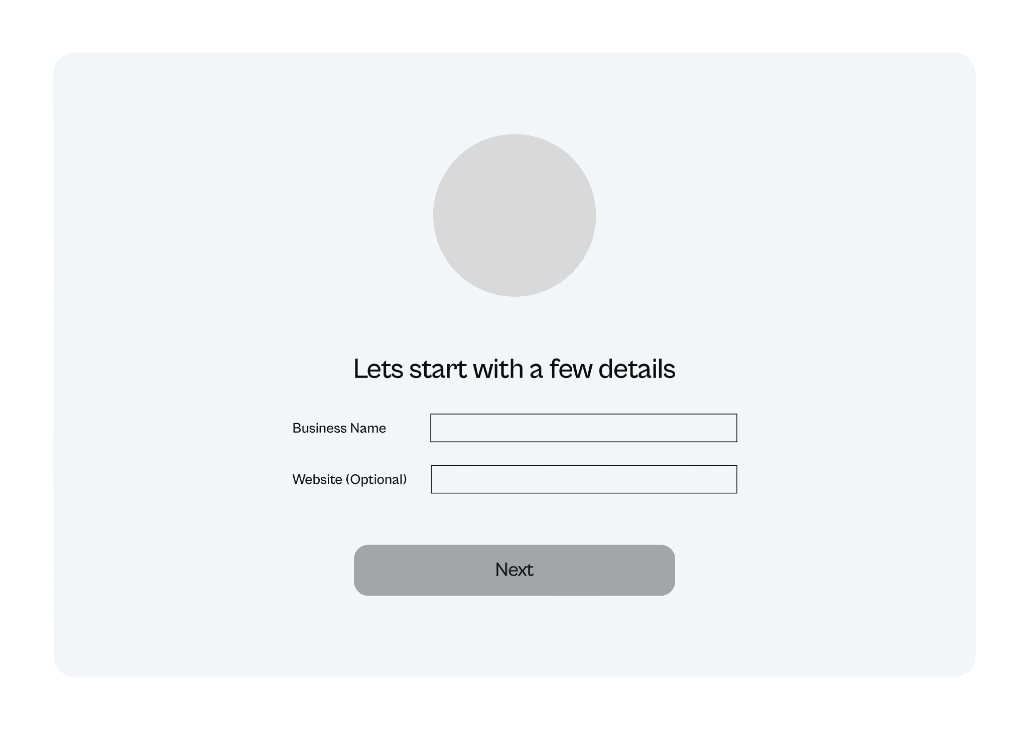
PROFILE CREATION
Key information is gathered to inform Kaie’s matching algorithm, and curate candidate recommendations. Users can set up their profile, create job listings, or view their dashboard.
PROFILE CREATION
Key information is gathered to inform Kaie’s matching algorithm, and curate candidate recommendations. Users can set up their profile, create job listings, or view their dashboard.
PROFILE CREATION
Key information is gathered to inform Kaie’s matching algorithm, and curate candidate recommendations. Users can set up their profile, create job listings, or view their dashboard.
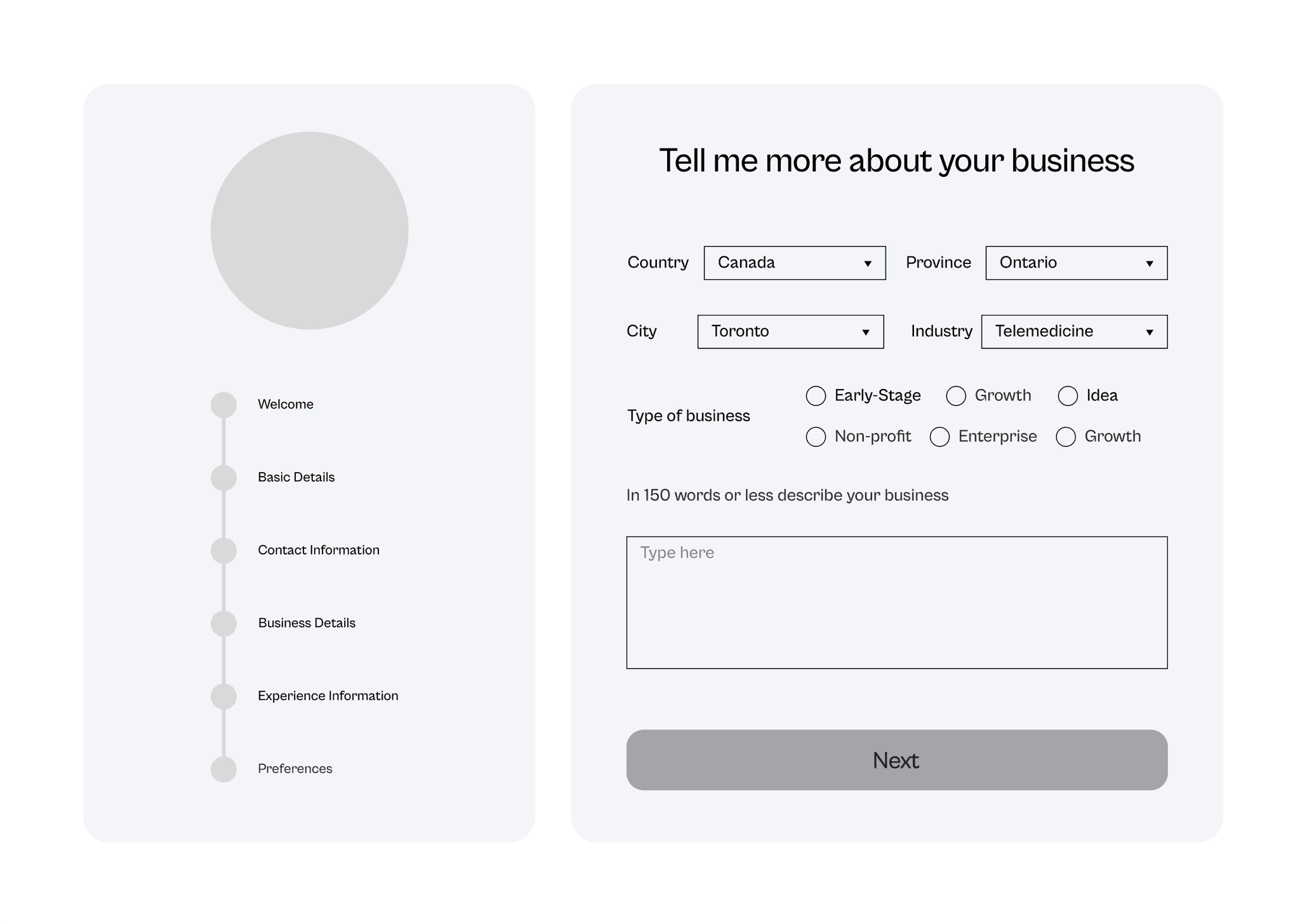
OPPORTUNITY CREATION
Once ready, users can create a job listing for the role they’re hiring for. Based on their input, they’re guided through a questionnaire that collects key business details and matching preferences. As users input details about the role, Kaie automatically processes the data and sorts candidates based on provided success criteria.
KEY RESULTS
With the new onboarding design, we saw a 22 percent increase in users completing the flow compared to the old Google Form version.
In a follow-up survey, business users rated their experience as an 8 out of 10 on average. Along with the reduced drop-off rates, this shows that users were engaging with Kaie during onboarding, resulting in less friction and higher completion rates.
Check out my other work with Kaie!
Check out my other work with Kaie!


Coming Soon
Profile (Kaie's Brain)
Kaie's AI hub where users manage and update their details.
Coming Soon
Profile (Kaie's Brain)
Kaie's AI hub where users manage and update their details.
Coming Soon
Profile (Kaie's Brain)
Kaie's AI hub where users manage and update their details.
Coming Soon
Website
The first touchpoint designed to turn visitors into active users.
Coming Soon
Website
The first touchpoint designed to turn visitors into active users.
Coming Soon
Website
The first touchpoint designed to turn visitors into active users.
Check out my other work with Kaie!
Coming Soon
Website
The first touchpoint designed to turn visitors into active users.
Coming Soon
Website
The first touchpoint designed to turn visitors into active users.
Coming Soon
Profile (Kaie's Brain)
Kaie's AI hub where users manage and update their details.